Global Containers Overview
Learn how to create and manage Global Containers to reuse shared UI (like headers, footers, and overlays) across multiple pages.
The Global Containers section in AVstudio lets you create persistent, reusable interface blocks that appear across multiple pages. Whether it’s a navigation bar, footer, or overlay, global containers help ensure design consistency while giving you control over placement and visibility on a per-page basis.
Navigating to the Global Containers Section
Global containers are reusable interface blocks that can appear across multiple pages. They’re typically used for elements like headers, footers, or overlays that need to remain consistent throughout the project.
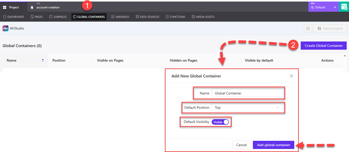
① Global Containers Tab – Located at the top of the project workspace, this tab opens the Global Containers section where all existing containers are listed.
② Create Global Container – Clicking this button opens the Add New Global Container dialog. From here, you can configure the container before adding it:
- Name – Enter a name to identify the container.
- Default Position – Choose where the container should be placed (e.g.,
Top,Bottom, etc.) using the dropdown. - Default Visibility – Toggle between
VisibleorHiddenas the default state for when the container loads.
At the bottom of the dialog, you can select Add global container to confirm, or Cancel if you decide not to create it.
Managing Global Container Settings
Once a global container is created, it appears in the list view. Each container has configurable settings that control its display behavior across pages.
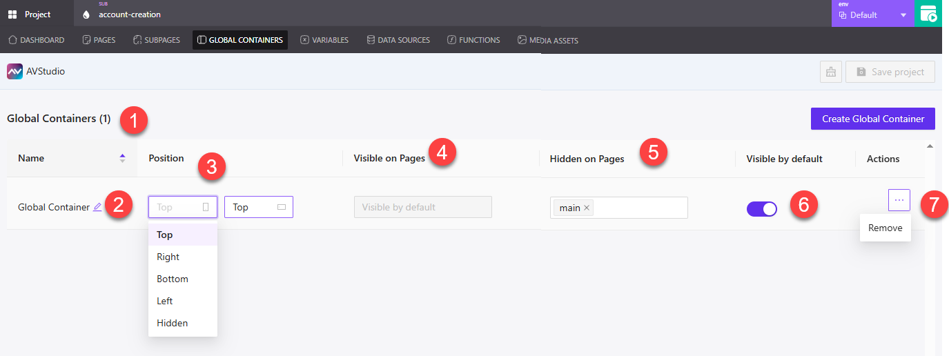
① Global Containers Header – Indicates how many global containers are currently added to the project.
② Name (Editable) – Click the pencil icon to rename the container directly from the list.
③ Position – Dropdown menu that lets you set the container’s position on the screen. Options include Top, Right, Bottom, Left, and Hidden.
④ Visible on Pages – Becomes active when Visible by default is turned off. Use this to define which pages should display the container.
⑤ Hidden on Pages – Becomes active when Visible by default is on. Use this to define which pages should not display the container.
⑥ Visible by Default – Toggle switch that determines whether the container is visible across all pages by default.
⑦ Actions Menu (Three Dots) – Opens the option to Remove the global container. This action is irreversible.
Visibility Toggle Behavior
The visibility settings dynamically affect which configuration fields are editable. Depending on whether Visible by default is toggled on or off, the interface adjusts accordingly.
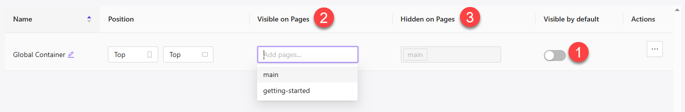
① Visible by Default (Off) – When this toggle is turned off:
- The global container is hidden on all pages by default
- The Visible on Pages field becomes active, allowing you to choose where the container should appear
- The Hidden on Pages field is disabled, since everything is hidden unless specified
② Visible on Pages – Lets you select individual pages (e.g., main, getting-started) where the container should be shown when Visible by default is off.
③ Hidden on Pages (Disabled) – This field is inactive when Visible by default is off. It only becomes usable when the toggle is on.
Summary
Global Containers provide a reliable way to reuse shared UI across your application. By configuring position, default visibility, and page-level exceptions, you can keep your interface consistent while tailoring where elements appear.