Initial Page Settings
Learn how to configure initial page settings—page name, CSS class, layout type, toolbar visibility, spacing, and parameters.
When you open a page in the editor, AVstudio automatically loads the Page Properties view. This is where you configure the basic identity and behavior of the page before adding content or containers.
What Are Page Properties?
Page Properties define the foundational characteristics of your page. These settings influence how your page is identified, behaves within the project, and adapts to layout rules.
👉 Use Page Properties to:
- Set the page name and internal identifier
- Define layout types (adaptive or responsive)
- Control toolbar visibility and page-specific settings
- Adjust spacing and container behavior
Accessing the Page Properties View
As soon as a page is opened in the editor, the Page Properties panel appears by default.
👉 To manually access it later:
- Open the desired page in the editor
- Click the Page Properties icon in the right-hand panel
Page Parameters Overview
Below is a summary of the key properties you can configure:
| Parameter | Description |
|---|---|
| Page Name | Visible label for the page in the project navigator |
| Internal ID | Unique identifier used for linking or referencing the page programmatically |
| Layout Type | Choose between Adaptive or Responsive layout behavior |
| Toolbar Visibility | Show or hide the editor toolbar on this page |
| Default Container Gap | Adjust spacing between containers on the page |
You can change most of these settings at any time, even after adding content to your page.
Editing Page Properties
When you open a page in the editor, AVstudio automatically loads the Page Properties view. This is where you configure the basic identity and behavior of the page before adding content or containers.
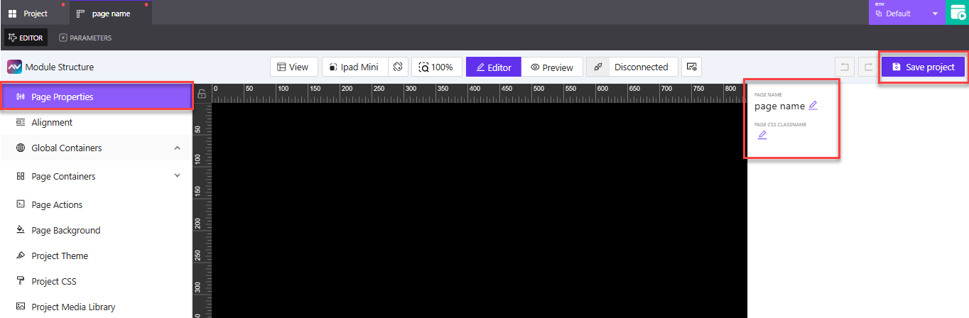
👉 The editor opens with the Page Properties tab selected in the left panel. This is the default view when editing a new page.
👉 Click the page name field in the upper-right corner to rename your page. Choose a name that reflects the screen's purpose in your interface.
Example: LobbyScreen, LightingControl, or UserSettings
👉 Use the page CSS class name field below the page name to assign a custom class for styling. This is optional, but helpful if you plan to apply specific CSS rules.
Example: dashboard-dark or main-layout-responsive
👉 After making changes, click the Save project button in the top-right to apply your updates.
In the next section, we’ll walk through the toolbar options available while editing a page, including layout orientation, device preview, zoom, and connection settings.
Toolbar Options While Editing a Page
When you're working inside the AVstudio page editor, you'll find a row of toolbar options that help you adjust layout, simulate devices, toggle views, and manage connections. This section covers each of those options, starting from left to right.
View Controls
The View control lets you manage layout guides that assist with alignment and structure inside the canvas.
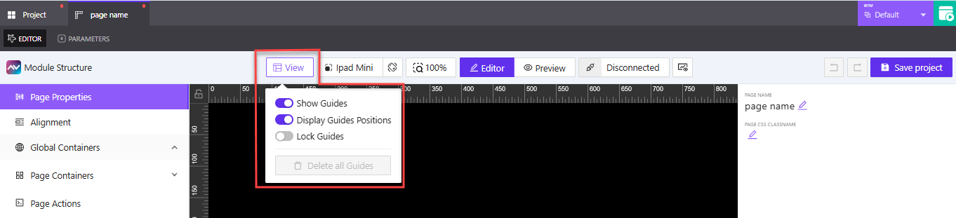
👉 Click the View button to open the layout guide dropdown.
👉 Toggle Show Guides to display alignment guides directly on the canvas. These help you position elements consistently.
👉 Toggle Display Guides Positions to show exact pixel values for each guide, useful for precision layout.
👉 Use Lock Guides to prevent accidental changes to guide placement.
👉 When enabled, Delete all Guides clears all layout guides from the editor in one action.
Test Device Selector
The test device selector allows you to preview how your page will appear on different screen sizes. It doesn't affect the final build — it’s just a helpful way to test layouts during editing.
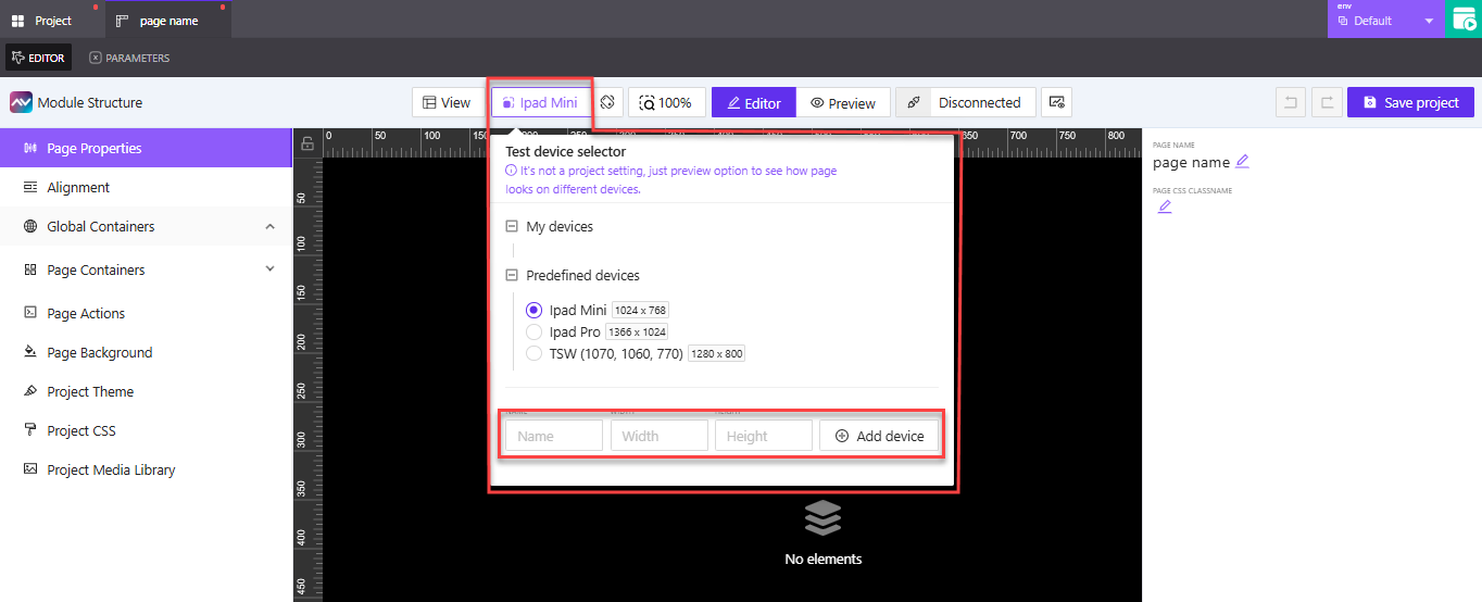
👉 Click the device name in the toolbar (e.g., iPad Mini) to open the selector menu.
👉 Choose from the list of predefined devices such as:
iPad Mini (1024 × 768)iPad Pro (1366 × 1024)TSW (1280 × 800)
👉 If you want to preview on a custom device, enter a Name, Width, and Height under the My devices section.
👉 Click Add device to save your custom option. It will appear under My devices for reuse.
This feature is useful for checking how adaptive or responsive layouts behave on various screen dimensions. More preview and layout tools are covered next.
Orientation Toggle
The orientation toggle allows you to switch the canvas view between portrait and landscape. This is especially useful when designing for devices that may rotate or be mounted differently.
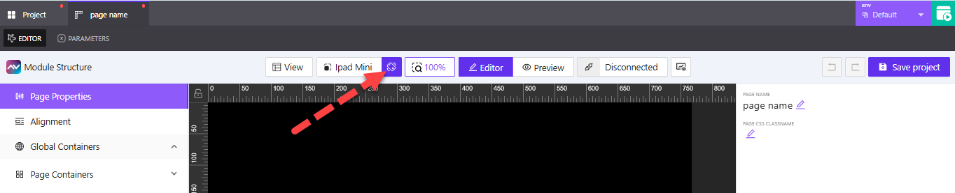
👉 Click the rotation icon in the toolbar to switch between Portrait and Landscape orientation.
👉 The canvas will update instantly to reflect the new layout, helping you test how elements respond to changes in screen direction.
Use this toggle to preview how your design will behave across different mounting setups or user interactions. This is particularly helpful for responsive layouts or kiosk installations.
Zoom Controls
The zoom control lets you adjust how much of the canvas is visible while editing. This can help when working on detailed layouts or when you want a full-page overview.
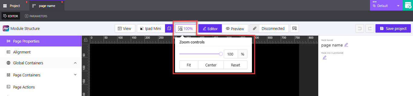
👉 Click the zoom percentage (e.g. 100%) to open the zoom settings.
👉 Use the slider or input box to manually set the zoom level.
👉 Click Fit to resize the canvas to fit the screen.
👉 Click Center to recenter the canvas if it has shifted.
👉 Click Reset to return to 100% zoom instantly.
These controls are useful for navigating large or complex layouts with more precision while designing.
Editor and Preview Toggle
The toolbar lets you switch between editing your page and previewing how it will look during runtime. This is helpful for testing layout, interactions, and visibility without leaving the editor.
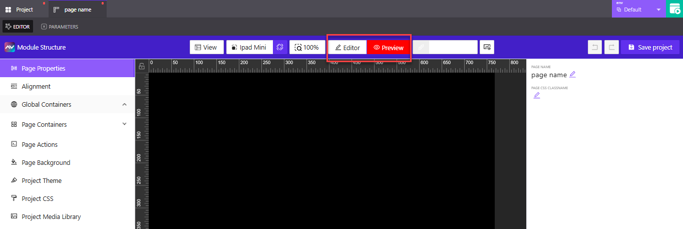
👉 Click Editor to stay in edit mode, where you can update containers, properties, and layout elements.
👉 Click Preview to simulate the live version of the page and see how it behaves without needing to build or publish.
Preview mode is great for spot-checking animations, positioning, and interactions before committing changes.
Connection Manager
The Connection Manager lets you simulate how your page interacts with connected systems. This is useful for testing signal routing and verifying dynamic behaviors during development.
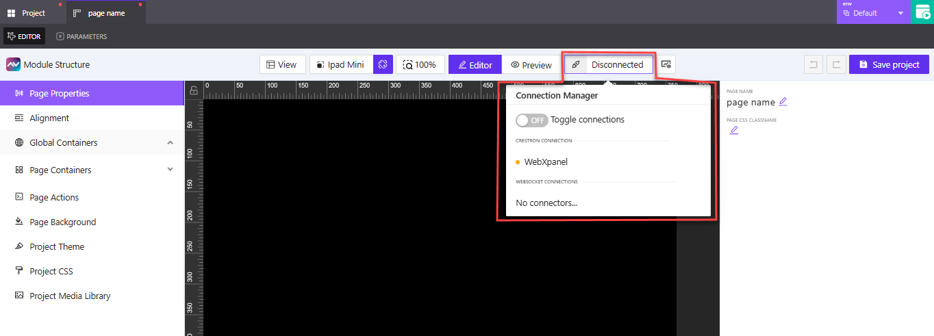
👉 Open the Connection Manager from the toolbar (look for the chain-link icon near the right side). Depending on the connection state, the label may say Connected or Disconnected.
👉 Use the Toggle connections switch to simulate connecting or disconnecting from the system.
👉 Any WebSocket connectors will appear in the WebSocket Connections section, if available.
Use this tool to test logic that depends on real-time connections, without deploying to actual hardware.
Show/Hide Console
The Show/Hide Console button lets you open a live debug panel directly inside the editor. This panel appears on the right-hand side of the screen and helps you monitor signals, parameter values, and system interactions in real time.
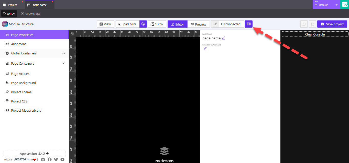
👉 Click the console icon in the upper-right toolbar to toggle the debug console. You’ll find it next to the Connection Manager icon.
👉 When enabled, the console opens along the right edge of the editor. You’ll see logs related to page activity, signal changes, and dynamic behaviors.
👉 Click the icon again to hide the panel and return to a cleaner editing view.
Use this tool while testing parameter logic, custom interactions, or integration behaviors. It’s especially useful when verifying changes without leaving the editor.
Undo and Redo Actions
The editor provides undo and redo icons so you can easily revert or repeat recent changes.
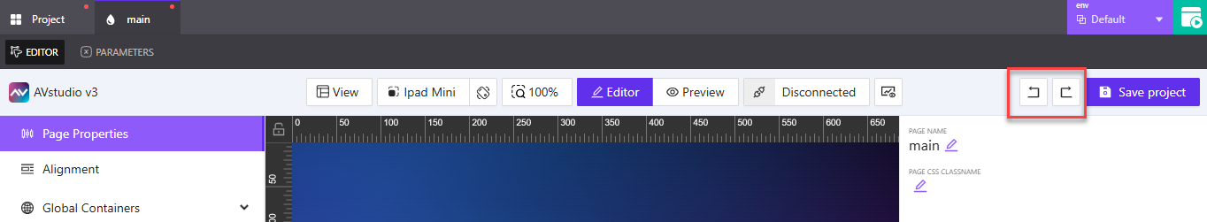
👉 Undo icon – Reverts your most recent change
👉 Redo icon – Re-applies the last undone action
These tools are useful when experimenting with layout or design settings, helping you quickly fix mistakes or test alternatives with confidence.
Working with Page Parameters
Page parameters allow you to store and pass dynamic values to a page. These values can be referenced throughout the page’s logic — for example, to control visibility, pass user input, or trigger conditional behavior. You can define parameters like booleans, numbers, or strings depending on what your layout needs.
Adding a Page Parameter
When you open a page in the editor, you’ll see two tabs at the top: Editor and Parameters. Click the Parameters tab to view and manage any page-specific parameters.
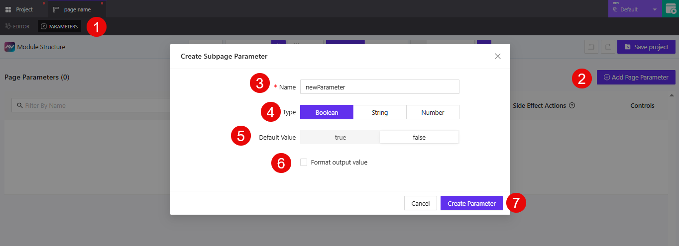
- Click the
Parameterstab besideEditorin the page editor view. - Click the
Add Page Parameterbutton to open the Create Subpage Parameter modal. - In the
Namefield, enter a unique identifier for the parameter.
Example:showWelcomeMessageoruserRole - Under
Type, select the kind of value the parameter will store:Boolean– true or falseString– any text valueNumber– numeric values
- Enter a
Default Valuethat will be used when the page first loads. - Enable the
Format output valuecheckbox if you want to transform the parameter before it's used. - If formatting is enabled, use the
Format value with functionfield to choose how the value will be processed.
Example: You could apply a function to change "on" to "ON", or round a number. - Click
Create Parameterto finish.
Why Use Page Parameters?
Parameters make your pages interactive and dynamic. You can use them to:
- Toggle visibility – Show or hide elements based on a
Booleanvalue. - Pass data – Use
Stringparameters to move text values between screens. - Trigger logic – Apply conditions based on
NumberorStringvalues for flow control.
Think of parameters as live, local variables that let your pages react to user input, logic conditions, or connection events.
Summary
In this article, you learned how to:
- Create a new page and select a layout paradigm
- Access the Page Editor and Page Properties
- Use the editor toolbar to manage orientation, zoom, device previews, and more
- Configure connection settings and debug with the console
- Add and manage page parameters to support dynamic logic
These tools help you define how your pages behave and how they adapt across devices. In the next article, we’ll walk through how to work with containers, actions, backgrounds, and other advanced layout elements.