How to Configure Dimensions
🎯 Learn how to set or adjust the width and height of any element in AVstudio.
This guide explains how to work with different measurement units, apply dynamic values, and understand how sizing behaves across responsive layouts.
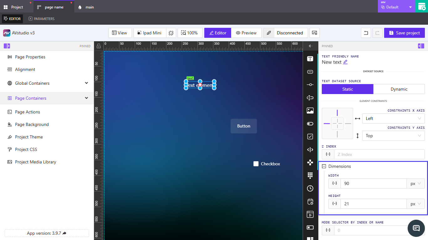
👉 Locating the Dimensions Section
- Open the page or subpage where the element is placed.
- Select the element in the
Editorworkspace. - In the properties panel on the right, scroll down and expand
Dimensions.

👉 Setting Width and Height
- Under
Dimensions, enter numeric values forWidthandHeight. - Each field includes a dropdown for selecting units:
px(pixels) or%(percentage). - Choose
pxfor fixed dimensions or%for relative sizing based on container width or height.
📌 When using percentages, the element’s size adjusts relative to its parent container. This is useful for responsive layouts.
👉 Using Dynamic Values
- Click inside the
WidthorHeightfield to activate the dynamic input option{–}. - You can assign a variable, parameter, or state value to make the dimension change automatically.
- Use the
fxicon if you need to apply a post-processing function to modify the bound value before rendering.
📌 Dynamic values let elements resize automatically based on external data or system feedback.
📌 Key Points
- Use
pxfor fixed sizing and%for responsive design. - Dynamic inputs (
{–}) make dimensions flexible and data-driven. - Dimension settings can be inherited from parent containers in nested layouts.
- You can reset or override inherited values directly in each element’s panel.
❓ Frequently Asked Questions (FAQ)
Can I mix px and % values for width and height?
Yes. For example, you can set the width in % for responsiveness while keeping height fixed in px.
What happens if I leave a field empty?
The element inherits its size from its parent container or default layout configuration.
Can dynamic values override static ones?
Yes. When a dynamic value is applied, it takes priority over any manually entered number.
Summary
Control element size by:
- Choosing px for fixed sizes or % for responsive sizing
- Binding dimensions to dynamic values for data-driven sizing
- Leveraging inheritance from parent containers where helpful
Use Fit/Reset and the editor preview to validate layouts across devices.